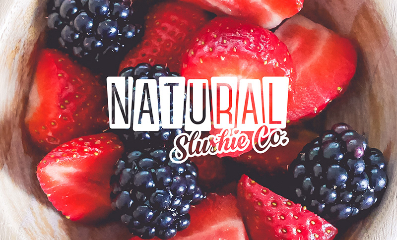
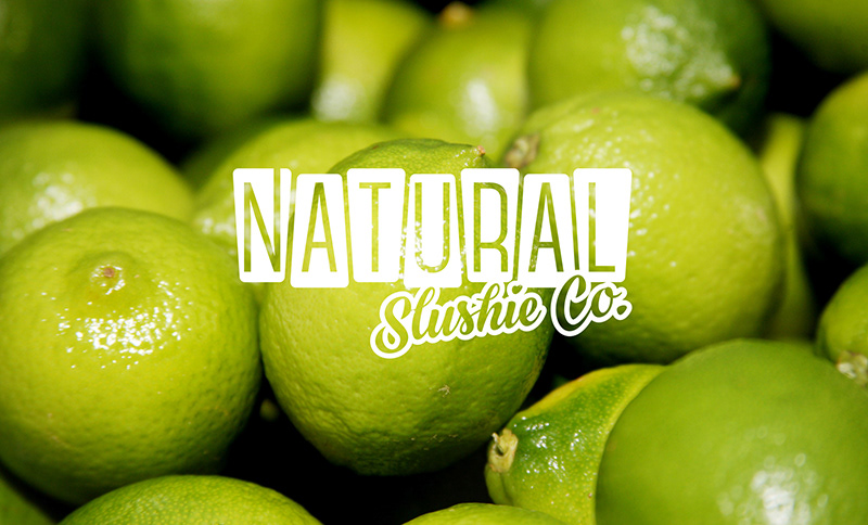
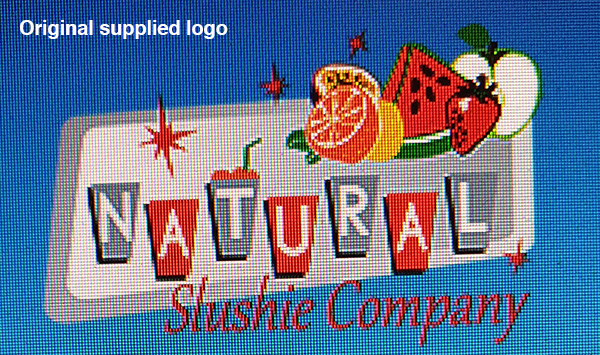
Logo refresh
The Natural Slushie Company have been making premium slushie blends for over 20 years. The Western Australian company offer healthy, natural beverages and hire out slushie machines for events, parties, clubs, shops, schools and more. With a change of management, the existing logo needed a refresh and more professional presentation.
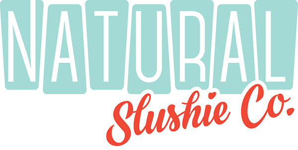
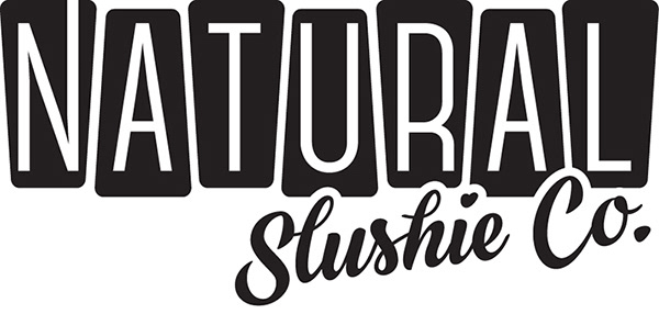
The original branding weighed heavily on mid-century stylings which was important to carry through in the redesign. I abandoned most of the external elements and brought everything back to the Company's name itself. The retro colour palette has been simplified to two-colours. The arrangement of the lettering has been brought together and the holding cups have been presented with a gentler tone. The straw presented in the original logo has been shifted to the start of the brand name as the 'N' extends to the top of the cup and for an added loving touch, the dot of the eye has been represented with a heart.